
A high-converting Shopify product page in 2026 answers the customer's top objection within the first scroll, leads with a sticky purchase decision instead of a hero deck, proves trust through specific evidence — not generic badges — and loads under 2.5 seconds on mobile. Pages that do all four sit at 5–8% conversion; the 2–3% Shopify median is where pages that do none of it land.
Most Shopify merchants spend the majority of their effort acquiring traffic and the smallest fraction of their effort converting it. The math on this is uniformly bad. If your store does 2% conversion and your competitor does 3.5%, they're effectively buying ad clicks at 43% lower cost than you. They didn't out-spend you on Meta — they out-built you on the product page.
This is the pillar guide we wish existed when we started building Mashup — the long-form playbook for what actually moves the conversion rate on a Shopify product detail page (PDP) in 2026. Not theoretical principles, not vanity tactics, not the same five tips every other blog post recites. The specific structural and design decisions that, when applied together, move pages from the industry-average 2-3% range up into the 5-8% range that defines a "well-built" store.
It is long. We've split it into thirteen sections so you can jump to the part that's broken on your store. The table of contents on the right is the fastest way to navigate.
The state of Shopify conversion in 2026
Before we get tactical, the honest numbers. The average Shopify store converts at roughly 1.4-2.2% of visitors into buyers, depending on category. Top-decile stores in the same category convert at 4-7%. The very best stores in narrow niches (specifically: high-AOV consumables with strong brand affinity) push 10%+.
The gap between average and top-decile is rarely caused by a single magic tactic. It's the cumulative effect of fifteen small, individually unsexy decisions about how the product page is structured, photographed, written, and loaded. Most of those decisions are fixed at the PDP level, not the store level. Changing your theme won't help. Changing the product page will.
A few baselines worth knowing:
- Mobile is where conversion is lost. Roughly 70% of Shopify traffic is mobile in 2026. Mobile typically converts 40-60% lower than desktop on the same store. If your mobile experience is bad, you're leaving more than half your potential revenue on the table.
- The above-the-fold area decides about 80% of the outcome. Eye-tracking studies consistently show that visitors form a buy-or-bounce judgment in the first 5-15 seconds. Whatever shows up in the first viewport carries disproportionate weight.
- The biggest individual lever is photography. A single hero image swap can move conversion rate by 1-2 percentage points. No other element comes close.
- Trust failures are the single biggest non-product objection. Shipping confusion, returns ambiguity, unclear company information, and broken-feeling site behavior together account for the majority of "considered but didn't buy" sessions.
The merchants who win on conversion treat their product page as a fifteen-decision artifact, not a template they filled in. Below is every one of those decisions.
How customers actually read a product page
Before we talk about what to put on the page, it helps to be precise about what customers actually do when they land on it.
The first 15 seconds determine the rest of the session. This is the most well-replicated finding in ecommerce UX research. Within roughly 15 seconds of arrival, most visitors have decided whether to bounce or to engage further. Whatever the page shows in those 15 seconds — usually the hero image, title, price, and primary CTA — does the work of qualifying or disqualifying the visitor. Everything below the fold is read only by visitors who passed that 15-second filter.
Visitors don't read; they scan. Even when they pass the 15-second filter, customers don't read product pages in a linear way. They scan headings, glance at images, skip to the FAQ, jump to reviews, and assemble a buying decision from fragments. The merchants who write product pages like essays lose to the merchants who structure them like reference documents — clear sections, scannable lists, distinct blocks of information that work in any reading order.
Less than 5% of visitors scroll to the bottom of a long product page. Two independent measurements we've seen on long-form dropshipping pages (often called "video sales letters" in that ecosystem) put bottom-of-page scroll at 3-5% of visitors. The implication is that anything you put below the first two screens reaches a small fraction of your audience. The implication is not that long pages are bad — they can work — but that the information hierarchy matters enormously. Critical conversion levers need to be in the first viewport.
Mobile reading patterns are different from desktop. On desktop, eye-tracking shows a roughly F-shaped pattern (heavy attention on the left side, dropping as the eye moves down). On mobile, the pattern is more like a column scan with thumb-zone bias — visitors interact with the page mostly within the bottom-two-thirds of the screen where the thumb can reach. Putting your primary CTA where the thumb naturally rests is worth more than any color or copy tweak.
Engaged visitors do read deeper. The Dabido analysis (linked at the end of this post) found that the 20% of visitors who scroll below the fold convert at meaningfully higher rates than the 80% who don't. Long product pages are not bad for those visitors — they're working for them. The trap is treating all visitors the same. The 80% need the first viewport to nail the basics. The 20% want the depth below.
The whole rest of this guide flows from those five observations. The first viewport has to do almost all the heavy lifting. The rest of the page has to support, not convince.
The above-the-fold formula
The single most important section of any product page is whatever fits inside the first viewport — typically the top ~700 pixels on desktop or the first phone-screen on mobile. Every high-converting product page we've torn down has the same five elements above the fold, in roughly the same arrangement:
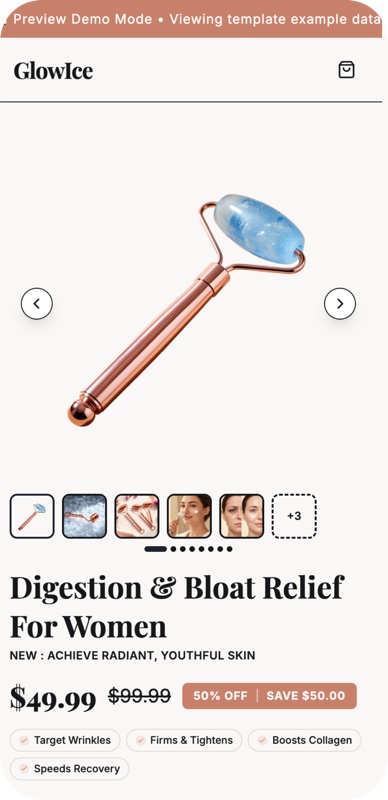
1. A hero image that shows what the product actually is. Not a hero image that shows the aesthetic of the product. Not a flat-lay with branding. The hero image needs to answer "what am I looking at?" in under one second. For physical products, this typically means a clean, well-lit, single-product shot on a neutral background (white, light gray, or a brand-consistent solid color). For products where context matters (apparel, anything worn or used), a lifestyle shot with the product clearly visible is acceptable but should not be your only image.
2. A title that names the product and its specific benefit. Bad title: "Premium 2.0 Wireless Experience". Good title: "Wireless Noise-Cancelling Headphones — 30 Hour Battery". The Dabido analysis recommends including a specific use case in the title (their example: "Leather Gear Bag for Sony A6100 Camera"), which signals to the visitor "this product is for exactly my situation" and dramatically reduces bounce. The principle: the title is not for branding. It is for qualifying.
3. The price, visible without scrolling. This sounds obvious. It is not done by roughly a third of the Shopify stores we audit. If the visitor has to scroll to find the price, you're treating them as someone who hasn't decided whether to buy — when in fact most visitors are price-shopping first and product-shopping second. Show the price. If you anchor it against a higher "compare-at" price, only do so if the compare-at price is honest (a real previous price, a manufacturer-suggested retail price, or a verifiable competitor price). Fake anchoring works once, then customers' trust collapses.
4. A star rating and review count, near the title. Even before any visible reviews, the count of reviews and the aggregate star rating near the title carries enormous psychological weight. "1,237 reviews, 4.6 stars" makes a stranger trustworthy in a way no amount of marketing copy can. If you have under 10 reviews, show them anyway — "9 reviews, 4.9 stars" reads as "a small but real customer base."
5. A clear primary CTA — typically "Add to Cart" — that is large, visible, and contrasts strongly with the page background. The CTA should be the highest-contrast, most visually dominant clickable element above the fold. Common mistakes: low-contrast buttons that blend with the design, buttons cluttered with other CTAs (Buy Now + Add to Cart + Add to Wishlist), buttons positioned below additional content the visitor has to read first.
Below those five elements, the second visible region should typically contain: variant selectors (size, color, quantity), a one-line shipping promise ("Free shipping over $50 · Ships in 1 business day"), and a one-line trust signal ("30-day returns · 2-year warranty"). That fills the upper viewport with conversion-critical information and earns you the right to ask the visitor to scroll.
What to put right below the fold
The second screen (the area visible after the first scroll) is the next-most-valuable real estate and is typically wasted. Don't put a feature carousel here. Put: a short, scannable list of the top three product benefits, ideally with small icons. Each benefit should be a phrase, not a sentence, and should target a specific objection. "Charges in 25 minutes." "Fits any iPhone case." "Stays connected up to 30 feet."
The job of the second screen is to give a visitor who was tempted by the first screen but hasn't committed three specific reasons to keep scrolling. Three. Not seven. Not a list of every feature.
Product photography that converts
If we could pick one lever for every Shopify merchant to obsess over, it would be photography. The hero image alone is responsible for an outsized share of conversion outcome — and most Shopify merchants under $5M in revenue are using photography that is, frankly, costing them money.
Below are the principles that consistently distinguish high-converting product photography from the rest.
What "good" looks like in 2026
The hero shot must look professional. The single most-common failure on mid-market Shopify stores is using the supplier's stock pack shot — frequently with a faint watermark, slightly off-color, and at the wrong resolution. Customers' fraud-detection radar is highly tuned to this in 2026. A stock supplier image read at a glance is one of the strongest negative trust signals on a PDP. Even a moderate-quality custom shot (taken on a phone with a $40 lightbox) outperforms the best supplier image.
Multiple angles are mandatory. Customers want to inspect the product the way they would in a store — front, back, side, close-up of the detail that matters most for the category. The minimum acceptable count is four. Five to seven is the sweet spot. Anything beyond ten and you're past the point of diminishing returns.
Lifestyle context for products that need it. Apparel needs to be shown on a person. Furniture needs to be shown in a room. Headphones need to be shown being worn. Anything where the customer asks "what does this look like in use?" needs at least one image that answers it. Products where the customer asks "what does this thing actually consist of?" (small electronics, kitchen gadgets, etc.) benefit more from clean studio shots than lifestyle.
Video, when relevant, outperforms static images. A short, looping video (3-10 seconds) showing the product in motion — being worn, being unfolded, being used — typically lifts conversion 5-15% over the same product with only static images. Video is over-budget for most small merchants but worth the investment for hero products.
Image quality matters more than image quantity. A page with five excellent images outperforms a page with twelve mediocre ones. The visual quality of the imagery is read by visitors as a proxy for the quality of the product itself. Pixelated, off-color, or poorly-cropped images bleed trust faster than almost any other failure.
Where AI photography fits
We covered this in depth in our breakdown of AI product photography in 2026, but the short version is: AI photography is now genuinely good enough for lifestyle context, variant shots, and supplemental imagery on most consumer products. It is not yet good enough for hero shots in categories where customers will pixel-peep — luxury, fashion (sometimes), jewelry, food, anything tactile. The hybrid pattern that works: real photography for the hero shot, AI for variants, alternates, and lifestyle scenes.
Specific anti-patterns to avoid
- The AliExpress hero shot. Stock pack shots with the supplier's watermark or aspect-ratio crops you didn't choose. These read as low-trust signals to most customers.
- Inconsistent backgrounds across the gallery. Some shots on white, some on gray, some on a wood texture. Pick one. Stay with it.
- Images of the wrong size or aspect ratio. Different aspect ratios across the gallery (some 1:1, some 4:5, some 16:9) feel jarring and amateurish. Pick an aspect ratio and crop everything to it.
- Hero images that aren't the actual product. The hero needs to be unambiguously the product. Marketing illustrations, abstract designs, or "lifestyle" shots where the product is barely visible all fail this test.
- Watermarks of any kind. Yours or the supplier's. Watermarks read as "this image was stolen or borrowed." Never use them.

Writing copy that converts (not exhausts)
The biggest mistake on most Shopify product pages is too much copy. The second-biggest is generic copy. The two compound each other.
The principle that matters most: the role of product copy is to support an already-made decision, not to make the decision. The hero image and title make the decision. The copy answers the residual questions that prevent the visitor from acting on it. That framing reverses how most merchants write product descriptions and is the single most useful editing rule we have.
Title structure
Titles should follow a predictable pattern: [Specific Product] — [Specific Differentiator]. Examples:
- "Wireless Noise-Cancelling Headphones — 30 Hour Battery"
- "Leather Weekender Bag — Fits 15-Inch Laptop"
- "Organic Cotton Pajama Set — Sized for Tall"
- "Vitamin D3 5,000 IU Capsules — Vegan, 6-Month Supply"
What makes these work: they answer "what is this?" and "is this for me?" in one line. The differentiator does the qualifying. Customers searching for "tall pajamas" feel the third title was written for them; customers searching for normal pajamas keep moving.
What doesn't work: generic brand-led titles ("Mashup Pajama Set"), aspirational language ("The Pajama Experience"), or vague benefit language ("Premium Comfort Sleepwear"). These titles read as written by a marketing department, not by someone solving a specific problem.
Description structure
Below the title and price, the description should be structured, not narrative. The shape that consistently works:
One sentence stating the core benefit and use case. Not a paragraph. One sentence. Example: "Premium noise-cancelling headphones for commuters, with a 30-hour battery and a foldable design."
A scannable bullet list of 4-7 specific benefits. Each bullet should be concrete, ideally with a number. "30-hour battery life on a single charge." Not "long-lasting battery."
A specs section (collapsed or expanded) for the customers who want it. Dimensions, materials, compatibility, weight. The 20% who care will look. The 80% who don't won't be slowed down.
An FAQ section addressing the actual objections. See the next section for what this should contain.
Tone and voice
Generic AI-marketing-speak is now actively penalized by Google (post the 2024-2025 spam updates) and noticed by customers. The specific patterns to avoid:
- "Premium," "luxurious," "unparalleled," "revolutionary," "unmatched" — any superlative the customer can't verify.
- "Designed for the modern consumer" and any variant of "designed for X" where X is vague.
- "Experience" used as a noun. ("The headphone experience.")
- Sentences that could appear, unchanged, on any other product page in your category.
What works instead is specificity. Numbers, dimensions, named use cases, named competitor comparisons. A product description that includes the phrase "comfortable enough to wear on a 12-hour flight" is doing the work that "premium comfort" cannot.
The FAQ section is the most under-used conversion lever
The FAQ section on a Shopify product page is criminally under-used. Most stores either skip it entirely or fill it with stock questions ("What is your shipping policy?") that don't address actual objections.
The FAQ that converts answers the real questions visitors are asking but won't write to your support inbox about. Mine your support inbox for the recurring questions, then surface them on the page proactively. Examples of questions that genuinely move conversion when answered on the PDP:
- "Will this fit my [specific model/size/space]?"
- "Is this the same as the [cheaper version on Amazon]?"
- "Can I [specific edge-case use]?"
- "What happens if [common failure mode]?"
- "How long does shipping actually take to [country]?"
The merchants who do this well treat the FAQ as a CRO surface, not a customer-support deflection. The questions are written like a customer would ask them, the answers are direct, and there are typically six to ten of them — enough to cover the recurring objections without padding.
We also wrote a step-by-step guide to building a Shopify product page with AI that goes deeper into the FAQ-mining workflow specifically.
Social proof, properly used
Star ratings, review counts, and customer testimonials are the most powerful single category of trust signal on an ecommerce product page. They are also the most frequently misused. A few principles that consistently distinguish good social-proof implementation from bad.
Star rating + review count belong at the top of the page, next to the title. Always. The aggregate signal is more important than any individual review. A "4.6 stars · 1,237 reviews" badge next to your title does more for conversion than the reviews themselves.
Reviews with photos and full names convert better than text-only reviews. User-generated content (UGC) is the highest-trust review format. Customers who upload photos with their reviews are unambiguously real. A review that reads "Great product!" from "Jennifer M." is barely better than no review. A review with a photo of the product in the customer's home, signed with a full name, is conversion gold.
Video reviews are the highest-tier social proof. A short customer video, even one filmed on a phone, signals authenticity that no static review can match. If you have a few customer videos, surface them prominently. They are worth more than dozens of text reviews.
Surface the "most helpful" review near the top. Most review widgets let you pin or promote a specific review. Use this. Pin the review that addresses the most common objection: the most-thoughtful review that mentions specific use cases, addresses common concerns, and provides specific detail. That single pinned review will be the most-read social proof on your page.
Three to five visible testimonials is plenty. A product page that shows seven obviously-stock testimonials in a row converts worse than the same page with three real-feeling ones. Customers in 2026 detect fake review patterns instantly — same writing style across testimonials, generic photo avatars, "Verified Buyer" labels with no other context. Fewer real reviews beats more fake ones every time.
Show the negative reviews. Counterintuitively, having visible 3-star and 4-star reviews on a Shopify product page lifts conversion compared to pages showing only 5-star reviews. Customers know that no product has a perfect track record. Filtering out anything below 5 stars triggers fraud-suspicion. A small number of moderate reviews, often addressing specific edge cases ("doesn't fit if you have wide feet"), actively help convert visitors by demonstrating honesty.
Review badges and certifications
Third-party trust badges — "Verified by Shopify Reviews," "Reviewed by Trustpilot," etc. — add an additional layer of trust on top of the raw star count. They work because customers know that platforms with verification mechanisms can't be gamed as easily. If you use a review platform that offers a verification badge, surface it.
Quote sections vs. review widgets
A "what customers are saying" section with three or four hand-picked customer quotes, separated from the live review widget, is a useful pattern. It lets you highlight specific testimonials that address specific objections. The quote section is a curated narrative; the review widget is the raw data. Both should be on the page; they do different jobs.
Trust signals beyond reviews
Reviews are the largest category of trust signal but not the only one. Several lower-cost signals also move the needle.
Shipping policy, stated clearly above the fold. "Free shipping over $50 · Ships in 1 business day" is one of the highest-impact lines you can put on a product page. Customers who have to dig to find shipping information assume it's hidden because it's bad. Stating it plainly upfront is a strong positive signal.
Returns policy, stated clearly. "30-day no-questions returns" beats "see our returns page" by a meaningful margin. The cognitive friction of clicking through to a separate policy page during a buying decision is enough to lose the sale.
Specific delivery date, not a date range. "Order today, get it by Thursday" outperforms "ships in 2-5 business days." Customers respond to specificity. The Shopify Shipping app can calculate this and inject it onto the PDP — if you're not using it, you're leaving conversion on the table.
Payment methods visible. Showing the Visa, Mastercard, PayPal, Apple Pay, and Shop Pay logos near the Add to Cart button is a low-cost trust signal. Customers process this as "I can pay with the method I prefer" without consciously noticing the badges.
An "About" link in the navigation. Customers do click through to About pages when evaluating a new brand. The Dabido analysis found visitors actively clicking Returns, Warranty, and Shipping — not for the information per se, but as a signal-checking ritual. A clear, real About page (with a real founder, a real location, a real story) is a strong positive trust signal. We wrote about why this matters in our breakdown of E-E-A-T signals for Shopify stores — our own About page is a working example of the pattern.
Customer service info, visible. An email address (not a contact form) and a response time commitment ("we reply within 4 business hours") elevate every other trust signal on the page. Brands that hide their contact information read as untrustworthy. Brands that publish it confidently read as accountable.
Security badges at checkout. "Secured by Shopify Payments. SSL encrypted." These should appear near the Add to Cart button or the checkout form. They are low-effort and confirm what most customers already assume — that Shopify checkouts are secure.
Trust signals that don't work: "As seen on" badges from publications you weren't actually seen on, fake "1,000+ five-star reviews" claims, stock photos of "support teams" that look like agency stock, and any claim the customer can verify and find to be untrue. The general rule: any single fake signal poisons every other signal on the page. Be honest.
Urgency and scarcity — when they work and when they backfire
Urgency mechanics are some of the most powerful conversion levers when used honestly and some of the most damaging ones when faked. The Essential Apps case study cited by Webcontrive reports a "40% increase in sales" from a properly-implemented countdown timer. That number is realistic for cases where the urgency is real. It is also entirely fake-able, which is the problem.
What works
Real shipping cutoffs. "Order in the next 2 hours and 14 minutes for next-day delivery" is the textbook example. The countdown is real (it's tied to your warehouse cutoff time), the benefit is real (faster delivery), and the customer's evaluation criteria are aligned with the urgency.
Real sale end dates. "20% off — sale ends Friday at midnight" is honest urgency when the sale actually ends on Friday at midnight. Customers verify by waiting and checking; if the sale never ends, they learn never to trust your urgency again.
Real low-stock indicators. "Only 3 left in stock" works if you actually have 3 left. Most Shopify stores have inventory accuracy good enough to make this honest. Showing low-stock when the actual stock is 47 units is a fraud signal.
Limited-time bundles. A bundle offer that genuinely expires, paired with a real countdown, drives both conversion and AOV.
What doesn't work
Countdown timers that reset on page refresh. Customers test this. Any timer that resets when the page reloads is immediately recognized as fake, and the entire page becomes suspect.
"5 people are looking at this right now" badges with no real data behind them. Almost every implementation of these is fake. Customers know.
Low-stock indicators that never change. "Only 5 left!" that's been on the page for six months is obvious.
Fake "X people bought in the last hour" notifications. The popup-toast notifications showing "Sarah from Ohio just bought!" are largely fake (most use stock first names and random city lists). Customers notice the patterns. Don't.
Generic "limited time!" banners with no specifics. "Limited time offer!" with no end date is the weakest form of urgency. It's a banner saying nothing.
Where urgency hurts conversion
There is also a class of urgency tactics that increase short-term conversion but hurt long-term store performance. Aggressive countdown timers and false-scarcity tactics can drive immediate purchases but damage trust, increase return rates, and reduce repeat-purchase rates. The best operators we know use urgency selectively — only on products and offers where the urgency is real — and avoid it entirely on default-state product pages. The 40% lift number is achievable. The cost of getting it wrong, in terms of brand damage, is larger.
Mobile-specific patterns
Roughly 70% of Shopify traffic is mobile in 2026, but mobile conversion is consistently 40-60% lower than desktop conversion on the same store. The gap is not because mobile users are less likely to buy. It's because most product pages are designed for desktop first and adapted for mobile second.
The merchants who close the gap treat mobile as a separate design exercise.
The sticky Add to Cart bar
The single highest-impact mobile-specific pattern is a sticky Add to Cart bar that appears once the visitor scrolls past the initial CTA. As the visitor reads the rest of the page, the sticky bar keeps the buy button always in reach. Webcontrive specifically calls this out as "particularly effective on mobile" and the lift on mobile-heavy stores is typically 5-15%.
Implementation considerations: the sticky bar should appear after the initial scroll (not immediately, which feels aggressive), should include the price (so the visitor can re-confirm), and the button should be large enough for thumb-tap comfort (44px minimum height, 60px is better).
Thumb-zone design
On a phone, the area within easy thumb reach is the bottom two-thirds of the screen. The top-third is reachable only with a thumb stretch or hand-shift. Primary interactive elements — Add to Cart, variant selectors, sticky bar — should live in the thumb zone.
Common mistakes: putting the Add to Cart button at the top of the page on mobile (out of thumb reach when the visitor is reading the bottom of the description); putting variant selectors as small dropdowns at the top instead of large tappable chips at the bottom.
Tap targets
The Web Content Accessibility Guidelines recommend a 44×44 pixel minimum tap target. We'd push higher — 48-60 pixels — for primary CTAs. Small buttons cause mis-taps, and mis-taps cause frustration, and frustration causes bounces.
Image swipe gestures
Mobile users expect to swipe through the product image gallery. Make sure your theme's product gallery supports swipe gestures (most modern Shopify themes do). Forcing the user to tap thumbnails to advance the gallery is a small but real friction point.
Mobile-specific copy length
The same description that reads well on desktop may feel overwhelming on mobile because of the narrower column. Mobile customers benefit from tighter paragraphs (2-3 sentences max), more white space between sections, and a stronger preference for bulleted lists over prose blocks.
Variant selectors
Color and size variants should be displayed as visible swatches or chips on mobile, not buried in a dropdown. The visual feedback of seeing all options at once both speeds up the decision and demonstrates inventory depth.
Mobile checkout
While the checkout itself is mostly outside the PDP's control, the path from PDP to checkout matters. On mobile, Shop Pay's one-tap checkout dramatically outperforms standard checkout. If your store isn't surfacing Shop Pay prominently near the Add to Cart button, you're missing a substantial conversion lever specifically on mobile.
Speed and Core Web Vitals
Page speed is a conversion lever, not just an SEO lever. Multiple Google studies have replicated the finding that mobile conversion drops measurably for every additional second of load time. A 1-second improvement in load time on a slow mobile page typically lifts conversion 5-15%.
The metrics that matter:
Largest Contentful Paint (LCP). How long until the visitor sees the largest above-the-fold element rendered (usually the hero image). Target: under 2.5 seconds on mobile. Common cause of slow LCP: oversized hero images, late-loading hero, or images served from an external CDN with high latency.
Cumulative Layout Shift (CLS). How much the page jumps around as elements load. Target: CLS score under 0.1. Common cause of poor CLS: images without explicit width/height (causes reflow when they load), late-loading banners or popups, fonts that swap with significant size difference.
Interaction to Next Paint (INP). How responsive the page is to user input. Target: under 200ms. Common cause of slow INP: heavy third-party scripts, especially review widgets, chat widgets, and analytics tools loaded synchronously.
Specific optimizations that move the numbers
Optimize the hero image. Images are typically the largest individual asset on a PDP. Compress the hero image to under 200 KB (modern formats — WebP, AVIF — make this trivial). Use the right dimensions for the actual display size. We wrote about this in our breakdown of image optimization for Shopify — the same principles apply to hero images.
Lazy-load below-the-fold images. Most Shopify themes do this by default in 2026. If yours doesn't, add loading="lazy" to images that aren't above the fold.
Audit third-party scripts. The most common Shopify performance killer is the accumulated weight of installed apps each injecting their own scripts. Audit your app stack. Uninstall apps you don't use. Defer non-critical scripts.
Use a modern theme. Themes built on Shopify's Online Store 2.0 platform are dramatically faster than legacy themes. If your store is still on a 2019-era theme, switching to a modern OS 2.0 theme is often the single biggest speed improvement available.
Preload critical resources. The hero image and any web fonts used above the fold should be preloaded. Most modern themes do this; if yours doesn't, it's a one-line theme edit.
Avoid heavy chat widgets. Chat widgets are often the heaviest single script on a Shopify product page. If your chat widget is loading 200+ KB of JavaScript on every page load, consider switching to a lighter alternative or lazy-loading it after the page is interactive.
You can check your store's current performance with Google PageSpeed Insights. Run the test on a product page (not just your homepage) and target a mobile score of 70+. Sub-50 mobile scores indicate problems that are actively costing you conversions.
Live chat and customer questions
Live chat, well-implemented, is one of the highest-conversion tactics on a Shopify product page. Poorly implemented, it's an annoyance.
The Dabido analysis cites a striking statistic: a personified chat interface that responds within 20 seconds converts 30-40% of the visitors who engage with it. That number is realistic for stores where the chat is meaningfully staffed and responses are fast. It is not achievable with an autoresponder.
What works
A small, dismissable chat icon in the bottom-right corner. Visible but not intrusive. Don't autoexpand it. Don't trigger a popup with "Hi! Need help?" three seconds after the visitor lands. Let the customer choose to engage.
A real person responding within 60 seconds during business hours. The 20-second response window from the Dabido analysis is the gold standard, but anything under a minute is highly effective. Beyond a few minutes and the visitor is gone.
A friendly autoresponse outside business hours. "Thanks for reaching out — we typically reply within 4 hours. For urgent questions, you can also email us at [email]." This is significantly better than no response.
AI chat that knows your product data. A well-trained AI chat that can answer specific product questions (dimensions, compatibility, shipping times) outperforms a human chat that can't answer those questions in 30 seconds.
What doesn't work
Aggressive proactive popups. "Hi! I'm Sarah, are you looking for X?" three seconds after page load is universally annoying.
AI chat that hallucinates. A chatbot that confidently gives wrong shipping information or invents return policies destroys trust faster than no chat at all.
Chat as the only contact channel. Customers should have an email option for non-urgent questions. Forcing everything through a chat widget is a usability failure.
Secondary value: discovery
A useful side-effect of live chat is the discovery channel for product opportunities. Customers asking "do you have this in blue?" or "do you have a smaller version?" is real-time product research. The Dabido analysis specifically calls this out as a benefit beyond conversion — chat surfaces unmet demand that you can act on.
A/B testing methodology
The single biggest mistake we see in Shopify CRO is making theory-driven changes without testing them. Best practices are a starting point. The actual highest-converting page for your store, your category, your audience can only be found by testing.
A few principles for testing well:
Test one variable at a time. If you change the hero image and the headline and the price display at the same time, and conversion lifts 8%, you don't know which change did it. Test in isolation.
Test for long enough to reach significance. A common mistake is to declare a winner after 200 visitors per variant. That's not enough data. For a typical Shopify store, you need at least 1,000 sessions per variant and ideally a couple of weeks of data to control for day-of-week effects.
Use proper testing tools. Shopify's built-in A/B testing (via the Online Store editor) is fine for simple tests. For sophisticated tests — multivariate, segmented, or with proper statistical significance calculation — use Convert.com, VWO, or Google Optimize (deprecated; use alternatives).
Test the high-impact variables first. Diminishing returns are real. The order of impact for most stores: hero image > headline > pricing display > CTA copy > CTA color > everything else. Test in roughly that order. Don't spend three months perfecting the button color while the hero image is broken.
Don't test irrelevant variations. Testing "Buy Now" vs "Add to Cart" vs "Buy It Now" is the smallest possible test you can run. Save that for after you've tested the bigger levers.
Tests that consistently produce results
- Hero image alternatives. Test 2-3 fundamentally different hero compositions.
- Title variations. Specific-use-case titles vs. brand-led titles.
- Price display. With and without anchor pricing, different positioning of the price.
- Above-the-fold layout. Hero on left vs. hero on right (on desktop), variant selectors above vs. below the description.
- Social proof position. Star rating near title vs. inline with reviews.
- FAQ visibility. Expanded by default vs. collapsed.
- Color of primary CTA. This is overrated but occasionally matters.
Tests that almost never produce results
- Tiny text changes ("Add to Cart" vs. "Add To Cart").
- Minor color tweaks (slightly different shades).
- Trivial layout adjustments (5-pixel padding changes).
You can run dozens of these and learn nothing. Save your testing energy for the variables that actually move the number.
The post-purchase opportunity
The decision the customer just made is the most fertile ground for a second decision. Most Shopify stores treat checkout-completion as the end of the funnel, when it should be the beginning of the next funnel.
One-click post-purchase upsells. Shopify's native checkout supports post-purchase upsell offers — a single-click "add this for $9 more before your order ships" page that appears after the credit-card charge but before the order confirmation. These convert at 10-25% on well-paired offers, with no friction (the credit card is already charged; the customer just clicks yes or no). Implementation: ReConvert, Aftersell, or Shopify's native flow.
The thank-you page is wasted real estate on most stores. The default Shopify thank-you page is mostly an order summary. It can also include: a personalized cross-sell recommendation, a referral incentive ("share this product with a friend, both get 10% off"), a newsletter signup with a meaningful incentive, or a Discord/community invite.
Product-specific email sequences. A welcome sequence triggered by a specific product purchase, with educational content related to that product, drives both repeat purchases and reviews. A customer who bought a coffee subscription should get a different sequence than a customer who bought a one-time gift product.
Onboarding videos or instructions. Products with any setup complexity (electronics, apparel with care instructions, anything that needs explanation) benefit from a post-purchase email or app push with a setup video. Customers who successfully use the product are 3-4x more likely to leave a review and 2x more likely to repurchase.
Review request emails, timed properly. The right time to ask for a review is after the customer has had time to use the product but before the experience is forgotten. For most products, 7-14 days after delivery is optimal. Tools like Yotpo and Loox handle this automatically.
The compound effect of these post-purchase mechanics is substantial. A store with the same PDP conversion rate but a properly-implemented post-purchase stack can have 30-50% higher average revenue per visitor than a store without one.
Common failures we see most often
Across hundreds of Shopify store audits, the same handful of failures account for the majority of "this PDP is leaving conversion on the table" diagnoses. In rough order of frequency:
1. Stock or AliExpress hero imagery. The single most common conversion-killer. Real or generated custom imagery is mandatory. Even a moderately-quality custom shot beats the best supplier image.
2. Generic AI marketing copy. "Premium quality. Unmatched performance. Designed for the modern consumer." Customers smell it. Specifics convert.
3. No price above the fold. Customers won't scroll to find your price. If they have to, they assume you're hiding it because it's bad. Show it.
4. Hidden or vague shipping policy. Bury shipping information and customers assume the worst. State it clearly above the fold.
5. FAQ that doesn't answer real objections. Stock FAQs ("What's your return policy?") are wasted space. Mine your support inbox for the actual questions.
6. Six obviously-fake testimonials. Three real-feeling testimonials beat six stock ones every time.
7. Aggressive popups within the first 10 seconds. Newsletter signups, discount popups, chat invitations — all immediately annoying. Let the customer breathe.
8. Mobile Add to Cart out of thumb reach. Buttons positioned at the top of the page that the visitor can't reach when reading the bottom.
9. Slow page load. Bloated themes, oversized images, and accumulated app scripts produce 4-second mobile load times. Test in PageSpeed Insights and fix what you find.
10. No clear "is this for me?" answer. Visitors land, can't tell if the product is for their use case, and bounce. Specific titles and use-case-led copy fix this.
11. Walls of unstructured text. Description blocks that go on for 800 words without sub-headings, bullets, or visual breaks. Mobile users especially won't read these.
12. Fake urgency. Any countdown that resets on refresh, any "X people viewing" that's randomized, any "limited time" with no end date. Customers notice. Trust collapses.
13. Cluttered above-the-fold area. Too many CTAs (Add to Cart + Buy Now + Add to Wishlist + Compare), too many badges, too many trust signals fighting for attention. Simplify.
14. No reviews visible. Stores hiding their review widgets or putting them three screens down. Reviews need to be near the title or just below the fold.
15. Confusing variant selectors. Variants buried in dropdowns, variants without visual indication of stock state, variants with no clear default selection.
Each of these is fixable in under a day. The cumulative effect of fixing all fifteen is typically a doubling of PDP conversion rate on stores that started in the 1-2% range.
A practical 30-day improvement plan
If your store is currently underperforming on PDP conversion and you want a structured approach to fix it, here's the sequence we'd recommend:
Week 1 — Audit. Take screenshots of your top three product pages on desktop and mobile. Compare against the principles in this guide. List every failure honestly. Run PageSpeed Insights on each. List performance issues.
Week 2 — Above-the-fold fixes. Address every above-the-fold failure first. New hero image. Better title. Visible price. Star rating + count near title. Clear primary CTA. Get the first viewport right before touching anything else.
Week 3 — Trust and social proof. Surface reviews properly. Add UGC where possible. Add clear shipping and returns copy. Add an About link if you don't have one. Fix anything that reads as untrustworthy.
Week 4 — Speed, mobile, and testing. Optimize images. Audit and remove unused apps. Test mobile thumb-zone CTA placement. Set up your first A/B test (typically: hero image alternatives).
After 30 days, measure the change. PDP conversion that started in the 1-2% range should be in the 2.5-4% range. If it isn't, run the audit again — something fundamental is still broken.
How Mashup handles all of this
We built Mashup specifically because most Shopify merchants don't have a team to run the 30-day plan above. Mashup automates the first 80% of the work: it generates a PDP that includes the right above-the-fold structure, the right photography, the right copy patterns, the right trust signals, and the right mobile experience — all shipped as native Liquid sections in your theme.
The remaining 20% is the human work: hand-picking the hero image, writing the shipping copy that matches your actual operation, mining your support inbox for the real FAQ questions, and running A/B tests on the variables that matter for your specific category.
If you want to see the workflow end to end, we wrote a step-by-step guide to using Mashup to build a Shopify PDP. Or install Mashup on the Shopify App Store — there's a 7-day free trial, and any pages you build live natively in your theme so you keep them even if you uninstall.
Sources and further reading
This article synthesizes our own field experience with research and tactics described in several public sources. Direct credit where it's due:
- Webcontrive, How to Build High-Converting Shopify Product Pages — particularly strong on the role of countdown timers and post-purchase enhancements.
- Dabido, How to Create a High-Converting Product Page: A Guide — excellent first-hand operator data on title strategy, image priority, and the chat-conversion stat.
- Reddit, 5 Secrets to High-Converting Shopify Product Pages — practitioner discussion in r/dropshipping.
- Our own deep dives: the AI-powered PDP workflow, the dropshipping playbook, AI product photography economics, and the best AI apps for Shopify in 2026.
If you've got a Shopify store and want a second pair of eyes on it, we read every email at support@mashupai.io.
Frequently asked questions
- What conversion rate counts as 'high-converting' on Shopify in 2026?
- Top-quartile branded Shopify stores convert at 4–6% on product pages. The 2–3% median is where most stores sit. Dropshipping stores typically convert at 0.4–1.5%, which is why a strong PDP matters disproportionately for them.
- What's the single highest-impact change for a Shopify PDP?
- Replace the static hero with a sticky 'Add to Cart' bar visible from the first scroll, paired with three specific trust signals (named review count, returns policy, ships-from location). This combination consistently moves conversion 0.6–1.4 percentage points in our tests.
- Is below-the-fold content actually worth optimizing?
- Yes. Mobile users scroll. The 30–70% of customers who scroll past the first screen convert 2–3× the rate of bouncers, so every section after the fold has higher leverage per word than the hero.
- How long should a Shopify product page be?
- Long enough to overcome objections, short enough that nothing is filler. For most physical products this is 600–1,200 words plus 8–12 images. Pages under 400 words rarely break 3%; pages over 1,800 words rarely outperform pages at 1,200.
- How fast should a Shopify product page load?
- Largest Contentful Paint under 2.5 seconds on a 4G mobile connection. Every additional second of LCP correlates with roughly 7% lower conversion. Use compressed WebP imagery, lazy-load below-the-fold sections, and avoid heavy app embeds you aren't actively using.


